有一个这样的方程,想把它的函数图像绘制出来,如何用 R 语言或者 TikZ 绘制出来?求助
\(x^2+y^2+z^2-2xyz=1\)

蒙特卡洛!

xyz三维 随机生成n个点,按f(x)<0, 标记点,然后画之

这公式看起来大概是个球

硬求解,然后画图

x_mat <- matrix(seq(from = -2, to = 2, length.out = 50), 
                nrow = 50, ncol = 50, byrow = TRUE)

y_mat <- matrix(seq(from = -2, to = 2, length.out = 50), 
                nrow = 50, ncol = 50, byrow = FALSE)

z_mat1 <- x_mat * y_mat + sqrt(x_mat ^ 2 * y_mat ^ 2 - x_mat ^ 2 - y_mat ^ 2 + 1)
z_mat2 <- x_mat * y_mat - sqrt(x_mat ^ 2 * y_mat ^ 2 - x_mat ^ 2 - y_mat ^ 2 + 1)

rgl::persp3d(
    cbind(x_mat, x_mat), 
    cbind(y_mat, y_mat), 
    cbind(z_mat1, z_mat2), 
    xlim = c(-2, 2), 
    ylim = c(-2, 2), 
    zlim = c(-2, 2), 
    col = "lightblue")

似乎wolframalpha的图少了一部分?说实话这个正好是个二次函数还能有求根公式,一般性的函数虽然可以考虑用uniroot去解,但是如果形式复杂的话,求解区间的参数interval并不好给。

fenguoerbian 谢谢。当我按照这个想法用 TikZ 绘图时,竟然有问题,看起来有点奇怪,又说不清楚,只好上图

\documentclass{standalone}
% TikZ 图形
\usepackage{tikz}
% 插入三维图形
\usepackage{pgfplots}
\pgfplotsset{width=13cm,compat=1.18}
\begin{document}

\begin{tikzpicture}
\begin{axis}
[ 
  hide axis,
  view={45}{45},
  colormap/viridis,
  axis equal image,
  samples=20, 
  samples y=20, 
  z buffer=sort, 
  opacity=0.7,
]
\addplot3 [surf,domain=-1:1] (
 {x},
 {y},
 {x*y-sqrt(x^2*y^2 - x^2 - y^2 + 1)}
);
\addplot3 [surf,domain=-1:1] (
 {x},
 {y},
 {x*y+sqrt(x^2*y^2 - x^2 - y^2 + 1)}
);
\end{axis}
\end{tikzpicture}
\end{document}

maxima 软件支持隐函数作图,下面的代码改了别人的,效果符合预期,细节还需调整。

hc:x^2+y^2+z^2-2*x*y*z=1;
draw3d(enhanced3d=true,implicit(hc,x,-1,1,y,-1,1,z,-1,1));

cone

rgl 包绘制的效果,无脑抄了一段,发现效果很好。

# 代码修改自
# https://gist.github.com/stla/c48977956eea1cf1cd581c6a5eab7686

f <- function(x, y, z) {
  x^2 + y^2 + z^2 - 2 * x * y * z - 1
}
gradient <- function(xyz) {
  x <- xyz[1]
  y <- xyz[2]
  z <- xyz[3]
  c(
    2 * x - 2 * y * z,
    2 * y - 2 * x * z,
    2 * z - 2 * x * y
  )
}

nx <- 100
ny <- 100
nz <- 100
x <- seq(-1, 1, length = nx)
y <- seq(-1, 1, length = ny)
z <- seq(-1, 1, length = nz)
g <- expand.grid(x = x, y = y, z = z)
voxel <- array(with(g, f(x, y, z)), c(nx, ny, nz))

library(misc3d)
surf <- computeContour3d(voxel, level = 0, x = x, y = y, z = z)

library(rgl)
mesh <- tmesh3d(
  vertices = t(surf),
  indices = matrix(1:nrow(surf), nrow = 3),
  homogeneous = FALSE,
  normals = -t(apply(surf, 1, gradient))
)

open3d(windowRect = c(50, 50, 550, 550))
bg3d(rgb(255, 255, 255, maxColorValue = 255))
shade3d(mesh, color = rgb(75, 0, 85, maxColorValue = 255))
light3d(theta = 30, phi = 45)

snapshot3d(filename = "images/ellipse-cone.png")

目前,还不知道怎么用 TikZ 绘制,TikZ 绘制出来的图是真的漂亮,期待。

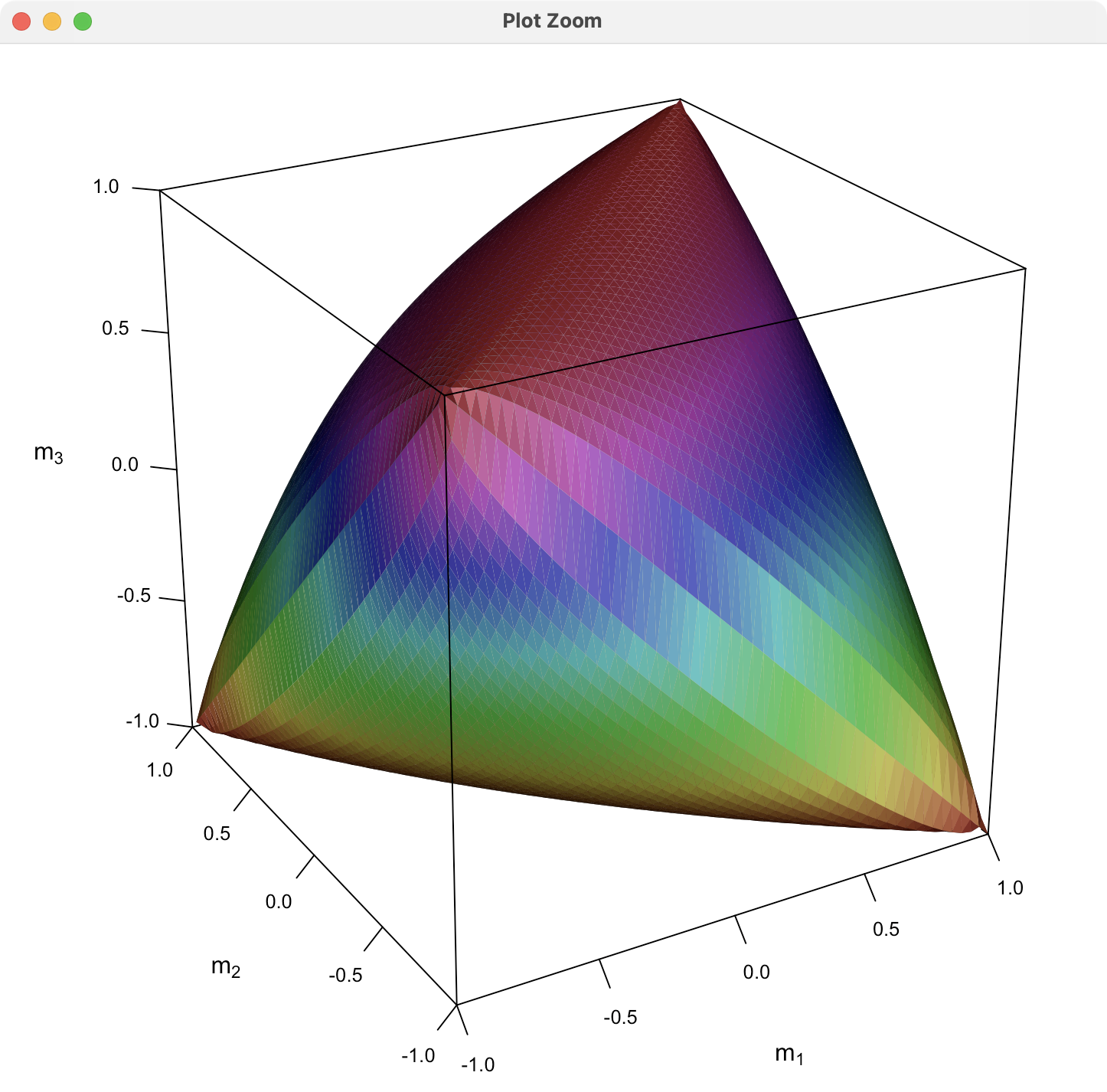
继续按照 fenguoerbian 的思路,用 lattice 包绘制这个图像。代码如下:

# 分两部分绘图
fn1 <- function(x) {
  x[1] * x[2] + sqrt(x[1]^2 * x[2]^2 - x[1]^2 - x[2]^2 + 1)
}

fn2 <- function(x) {
  x[1] * x[2] - sqrt(x[1]^2 * x[2]^2 - x[1]^2 - x[2]^2 + 1)
}

df1 <- expand.grid(
  x = seq(-1, 1, length.out = 51),
  y = seq(-1, 1, length.out = 51)
)
df2 <- df1
# 计算函数值
df1$fnxy <- apply(df, 1, fn1)
df2$fnxy <- apply(df2, 1, fn2)
# 添加分组变量
df1$group <- "1"
df2$group <- "2"
# 合并数据
df <- rbind(df1, df2)

library(lattice)
# 自定义调色板
custom_palette <- function(irr, ref, height, saturation = 0.9) {
  hsv(
    h = height, s = 1 - saturation * (1 - (1 - ref)^0.5),
    v = irr
  )
}
# 绘图
wireframe(
  data = df, fnxy ~ x * y, groups = group,
  shade = TRUE, drape = FALSE,
  xlab = expression(x[1]),
  ylab = expression(x[2]),
  zlab = list(expression(
    italic(f) ~ group("(", list(x[1], x[2]), ")")
  ), rot = 90),
  scales = list(arrows = FALSE, col = "black"),
  shade.colors.palette = custom_palette,
  # 减少三维图形的边空
  lattice.options = list(
    layout.widths = list(
      left.padding = list(x = -0.5, units = "inches"),
      right.padding = list(x = -1.0, units = "inches")
    ),
    layout.heights = list(
      bottom.padding = list(x = -1.5, units = "inches"),
      top.padding = list(x = -1.5, units = "inches")
    )
  ),
  par.settings = list(axis.line = list(col = "transparent")),
  screen = list(z = 30, x = -65, y = 0)
)

之前提及 TikZ 绘图效果很奇怪,我把绘图区间限制在 \([-1,0] \times [-1,0]\) 观察效果,代码如下

\documentclass{standalone}
% TikZ 图形
\usepackage{tikz}
% 插入三维图形
\usepackage{pgfplots}
\pgfplotsset{width=13cm,compat=1.18}
\begin{document}

\begin{tikzpicture}
\begin{axis}
[ 
  view/h=-30,
  colormap/viridis,
  samples=20,
  axis equal image,
  z buffer=sort,
  opacity=0.7,
]
% \addplot3 [surf,domain=-1:0] (
%  {x},
%  {y},
%  {x*y - sqrt(x^2*y^2 - x^2 - y^2 + 1)}
% );
\addplot3 [surf,shader=interp,domain=-1:0] (
 {x},
 {y},
 {x*y + sqrt(x^2*y^2 - x^2 - y^2 + 1)}
);
\end{axis}
\end{tikzpicture}

\end{document}

这就可以很方便地看出奇怪之处了,图形竟然不连续,下图中圈出来的红色部分。

我来两个非代码解决方案。

首先,可以用 macOS 自带的 Grapher:

其次,可以用 Blender + Sverchok:

9 个月 后

Cloud2016 去年把这个问题提交给 pgfplots 开发者,今收到回复,原因竟然是浮点数问题,将方程改写一下就好了。