import matplotlib.pyplot as plt
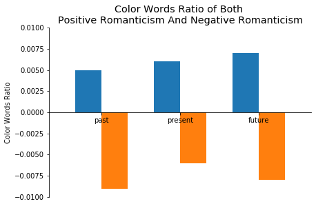
posTenseColorCount = [0.005, 0.006, 0.007]
negTenseColorCount = [-0.009, -0.006, -0.008]
xlabel = ['past', 'present', 'future']
xmid = [1.0, 2.5, 4.0]
posx = [0.75, 2.25, 3.75]
negx = [1.25, 2.75, 4.25]
fig, ax = plt.subplots()
ax.spines['top'].set_color('none')
ax.spines['right'].set_color('none')
ax.xaxis.set_ticks_position('bottom')
ax.spines['bottom'].set_position(('data', 0))
ax.yaxis.set_ticks_position('left')
plt.style.use('ggplot')
ax.set(ylim=[-0.01, 0.01], xlim = [0,5], xlabel='',
ylabel='Color Words Ratio')
plt.title('Color Words Ratio of Both \nPositive Romanticism And Negative Romanticism', color = 'black')
plt.bar(posx, posTenseColorCount, width=0.5)
plt.bar(negx, negTenseColorCount, width=0.5)
ax.set_xticks(xmid)
ax.set_xticklabels(xlabel)
出来的效果是
横轴标签被遮挡了,不知道怎么搞?
